 This post should be entitled “In Praise of Margaret M. Wagner,” since she created the design and typography of Robert Alter’s translations of the Bible for W. W. Norton, beginning with the very first, The Book of Genesis (1996). More than most readers may even be aware, her contribution, evident on every page, mediates Alter’s words, making each translation handsome, accessible, and eminently readable. Indeed, it may be the greatest compliment to the design that most readers see through it and never notice how it functions so clearly and effortlessly.
In a recent e-mail exchange, I asked Ms. Wagner if she had any particular effect in mind when she set about designing Alter’s first translation. Here is what she said:
When I agreed to design Genesis, it was made clear that the commentary had to be comfortable to read without straining the eyes. When it comes to logic, it almost designed itself. I love big margins and dislike having to pry books at the spine in order to read when the inside margin is too tight. I was not trying for any particular effect other than what was necessary.
The text and commentary font is Fairfield LH Light, which in 1996 was one of the handsome, accommodating book fonts with many style options, such as small caps, compared to some of the other book fonts available then which lacked its range of styles. Fairfield expresses dignity without being dull.
What also required thought was choosing a display font for the series that could accommodate long or short titles and long words that might require an entire line. The condensed display font takes care of that, although even so, it sometimes has to be a bit smaller. Depending on space and aesthetics, some of the books in the series have ornaments and some do not. Sometimes the large chapter opening initial had to be smaller in order not to disrupt the flow and style of the text.
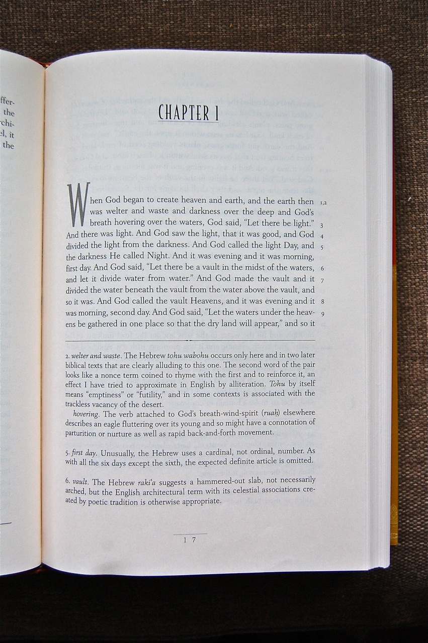 “It almost designed itself”: I love that. Form follows content. But Ms. Wagner is also being too modest, because the original design has been carried forward over subsequent editions with very little alteration, surely a testimony to the original design’s versatility and elegance.
For those who like to read about typography, the website MyFonts describes the Fairfield family this way:
Fairfield is a fifty-year-old typeface that has had a recent facelift. Rudolph Ruzicka, artist and book illustrator, designed light and medium weights of Fairfield for Linotype in 1940 and 1949, respectively. For Fairfield’s 1991 release as an electronic typeface, designer Alex Kaczun added bold and heavy weights.
With its straight, unbracketed serifs and abrupt contrast between thin and thick strokes, Fairfield harks back to the modern typefaces of Bodoni and Didot, but has a distinctly twentieth-century look.
Fairfield is a fine text face, both for books and shorter texts. Kaczun added small capitals and old style figures, swash capitals, and a set of “caption” typefaces (sloped roman style) that were inspired by Matthew Carter’s extensions to Oldstyle 7 for National Geographic magazine.
Ruzicka himself observed: “The reader expects optical assistance with reading. He does not want to be distracted while interpreting and understanding the ideas of a text.” And this is exactly how one experiences the type Ms. Wagner has chosen while reading the text.
The translation is set in 11-point type, with the commentary in 10-point type. Neither require the strain or the distraction that one finds in most settings of the Bible. Even the most beautiful Bible on the market, the ESV Clarion Reference Edition, is set in 8.75-point (in a font called Lexicon No. 1). And the Pitt Minion Reference takes it down to 6.75. Not for these tired eyes!

At 6.125 x 9.25 inches, the trim size of Ancient Israel: The Former Prophets: Joshua, Judges, Samuel, and Kings (2013) is slightly wider than the standard trim size for hardcover fiction (6 x 9). Larger than a standard Bible, it feels monumental and substantive in your hands but never oppressive. What surprises me most about the trim is that a 10-percent reduction produces an entirely different effect in the softcover. The paperback edition of The Book of Psalms, for instance, maintains the proportions of the originals, but is transformed into a tight and portable package. It is perfect for devotional reading, especially with its supple lay-flat binding. During a sermon series on the Psalms this summer, it became my constant companion and withstood considerable abuse.
There are other appointments that make the editions a welcome addition to any collection. The Five Books of Moses (2004) comes in a slip case, and it and The Book of Psalms (2007) come with a sewn-in ribbon, following a long-standing tradition in Bible making.
Ms. Wagner has done both Professor Alter and his readers a great service over the years. It is my hope that others will come to appreciate the simplicity and the power of these fine translations of biblical literature—and, it should go without saying, to have a personal encounter with the One who breathed out its words and imbue them with life today.
